Wood-Block Printing
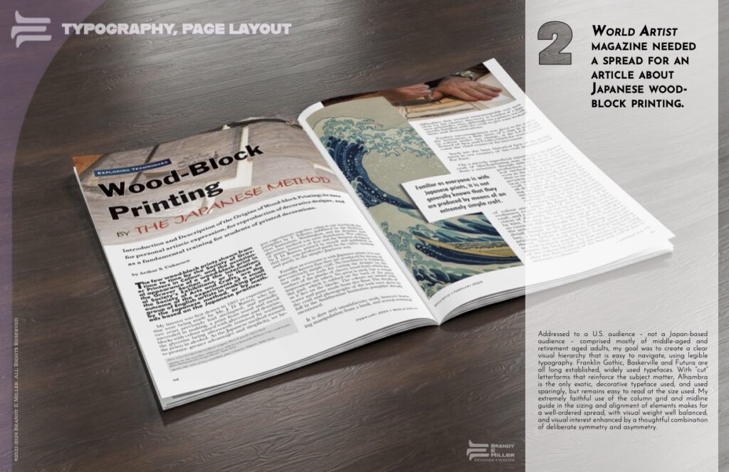
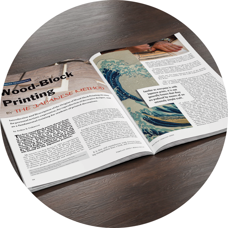
World Artist magazine wanted a spread designed for an article about Japanese wood-block printing.
Addressed to a U.S. audience – not a Japan-based audience – comprised mostly of middle-aged and retirement aged adults, my goal was to create a clear visual hierarchy that is easy to navigate, using legible typography. Franklin Gothic, Baskerville and Futura are all long established, widely used typefaces. With “cut” letterforms that reinforce the subject matter, Alhambra is the only exotic, decorative typeface used, and used sparingly, but remains easy to read at the size used. My respect for columns and midline makes for a well-ordered spread, with visual weight well balanced, and visual interest enhanced by deliberate symmetry and asymmetry.
Project Details
Woodblock Printing Magazine Spread
2023-2024
Designer(s)
- Brandy E Miller
Client(s)
- World Artist Magazine
- (fictitious – SNHU student work)
Deliverables
- 2-page Spread (A4)
- 2-page Spread (Letter)
Tools / Resorces Used
- Adobe® InDesign®
- Adobe® Stock®
- Adobe® Photoshop®
Print Portfolio Sheet